Check out real-life packaging examples used by businesses and an explanation of why they work.
It may not seem like it but the stationery business is a competitive market. If you want to rise above other players, you’ll need packaging that’s unique and compelling.
In this post, you’ll find examples of great stationery packaging and a brief explanation of why each one works. These are all real-life packaging used by businesses to attract customers.
Later on, we’ll discuss design elements that you have to consider when creating packaging for your brand.
Let’s begin.
Real-World Stationery Packaging Examples
Here are several packaging examples specifically for stationery businesses.
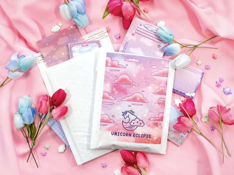
Bubble Mailers by Unicorn Eclipse
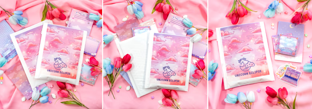

Bubble mailers allow stationery retailers to protect their products during shipping. These padded envelopes are great for mailing small and light items like pens, markers, paper, stamps, tape, and similar products.
When paired with an amazing design, bubble mailers can be anything but boring. Using loud colors will certainly catch your customer’s attention. You can even use it to elicit particular emotions. In this particular example, it uses pink — a color that’s closely tied to happiness.
Stationery Boxes by Mardoodles Company
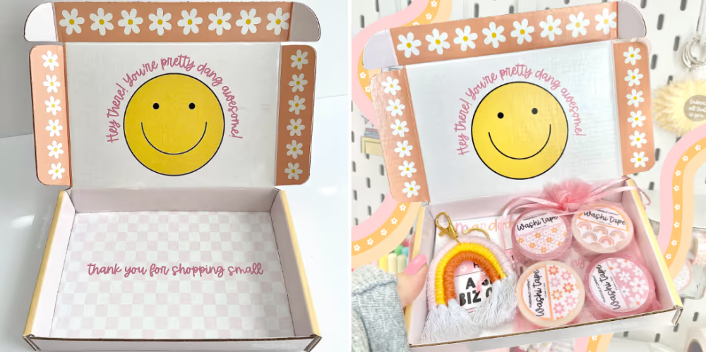

Stationery boxes—also referred to as mailer boxes—are ideal for mailing large items. In this case, they’re used to ship tape but you can use it to send other stationery products.
The nice thing about mailer boxes is that they give you enough room to be creative with your design. You also have space to enter special messages for your customers.
Text is an important component of stationery packaging, especially if you’re running a small business. You want to make a connection with your audience.
Giving a compliment will go a long way. And you should go out of your way to show how much you appreciate their purchases.
Stationery Mailer Boxes by Here and There Weddings
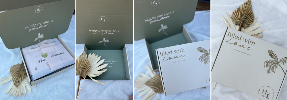

Some businesses specialize in producing stationery products for special events like weddings. If you belong in that category, then you’ll want to keep your packaging design simple and classy. People may have different tastes but you can never go wrong with a timeless design.
Use simple fonts and a solid background color. Speaking of color, try to use a subtle one. You don’t want to use anything strong. When in doubt, use white for a clean design. The use of text should be kept to a minimum.
A stationery mailer box is a great place to store invitations and other wedding-related materials.
Packaging Tape by Audrey Okeya
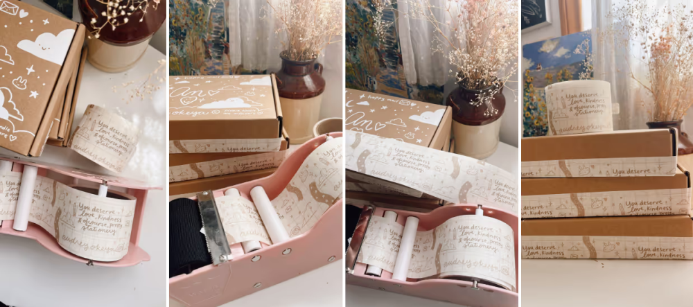

Packaging tape is a creative way of adding design elements to your boxes, poly mailers, or gift bags. Most companies will rely on their logo or business name for their packaging tape designs. But you can push it to include messages for customers.
Some even use packaging tape to provide instructions for carriers.
You’re better off maximizing all that space, especially if you’re using plain, unbranded packaging. It could be the only branding element you need if you make your packaging tape large enough.
Just make sure you don’t clutter it with too many design elements so you don’t overwhelm your customers.
Stationery Gift Boxes by Ally Blair Co.
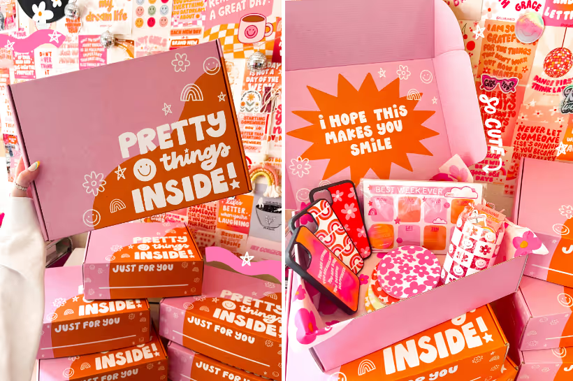

Use your stationery packaging to generate hype. This adds to the overall unboxing experience that buyers look for. Create copy that would appeal to your target audience. Try to build your customers’ anticipation as best you can.
You can show your brand personality through text and design language. Keep your design simple if you want your stationery business to seem sophisticated. Or use different fonts to appear fun and quirky.
Don’t be afraid to experiment. A stationery packaging printer like PackM lets you order box samples if you want to see printed packaging first before committing to larger order quantities.
Custom Poly Mailers by Kindness and Koffee


Floral poly mailers aren’t a bad idea for stationery sellers. If you’re mostly offering traditional stationery products, this is the sort of packaging customers would expect to receive.
If kept restrained, your design could draw the right kind of attention. Again, you could use inspirational copy to make your customers feel great about their purchase.
Those who want to create their poly mailers themselves but lack the confidence or the experience to do so can start with a text-centric design such as the one in the example.
A design like this one is something you can easily create using the free-to-use PackM Design Tool.
Stationery Packaging by Sundrop Studies


A common theme with these stationery packaging examples is simplicity. In this case, the design only uses the company logo and a repeating fruit pattern. The background color is white which keeps the box looking sleek.
The box has tissue paper inside that manages to tie everything together once opened.
This design truly shows a lot of personality, which makes it ideal for younger stationery brands. If your target audience is people in their early teens to young adults, this could be the right vibe for your packaging.
Stationery Tissue Paper by Pocket Peaches


Tissue paper can become an extension of your stationery products. How? By sharing the same design elements. For example, featuring the same cartoon characters on your products and packaging will tie everything together nicely.
You should also use the same colors throughout your products and tissue paper so your presentation looks cohesive and well-planned.
Tissue paper comes in sheets so you can trim it down to size. You don’t want to use an excessive amount of tissue paper in your packaging.
Subscription Boxes by Allie Rose Co.


Stationery subscription businesses will need packaging that’s nothing short of amazing. You want to keep customers coming back. And your packaging will help convince them to continue their subscriptions.
You have to make every box you send feel special. Include messages that’ll get recipients excited for their next box.
It’s also a great idea to include other marketing materials when you send products. Postcards, stickers, and business cards are just a few examples. You’ll want to switch up your designs every couple of months just to keep things fresh.
Stationery Mailer Boxes by Musically Minted


Having a theme is a fantastic idea because it makes it clear to customers what your stationery brand is all about. This example uses musical design elements to get its message across.
Add the friendly tone and you’ve got a stationery mailer box design that really speaks to consumers. Adding text inside the box gives your customers a nice surprise.
However, you should only have a theme that makes sense for your brand. It should reflect your products or company philosophy. You don’t want to use a theme that’s disconnected from your brand messaging.
If you’d like to see more packaging design examples, go check out the PackM Design Hub.
Stationery Packaging Design Elements
Below are some of the design elements that all entrepreneurs should consider when designing their packaging.
Colors
Colors will affect how shoppers see your brand as they evoke emotions. You can also use them to convey your brand message and enhance your packaging’s appeal.
In some cases, they help businesses differentiate themselves from the competition. Some colors resonate with specific groups of people. For example, using earthy tones will appeal to environmentally conscious consumers.
Images
Images make packaging more exciting and informative. You can tell stories with the images you add to your boxes, poly mailers, and marketing materials. With the right photos, you can even form connections with potential customers.
If you’re consistent with the images you use, people will have an easier time recognizing your business. This will give them more reasons to trust your brand. Images are also useful for highlighting specific product features.
Copy
The text you use in your packaging will give customers valuable product information. You can use copy to tell everyone what your brand is all about. And don’t forget to mention your products’ unique selling points.
You can also use your packaging copy to share usage and care instructions. Or you can promote other stationery products. It’s always a good idea to mention your social media pages so people can follow you online.
Order Custom Stationery Packaging Online
If you need help with your stationery packaging, PackM can help. We have a feature called Design Tool that lets you create packaging designs for free. No need to download any app because you can use this feature online.
You can add images and enter text. Resize and reposition these elements until you’re happy with how everything looks. Use the live preview feature to see what your packaging looks like before it’s even printed.
Those who’d like to know more about our services can get in touch via phone or live chat. We’ll be happy to answer all your questions.
